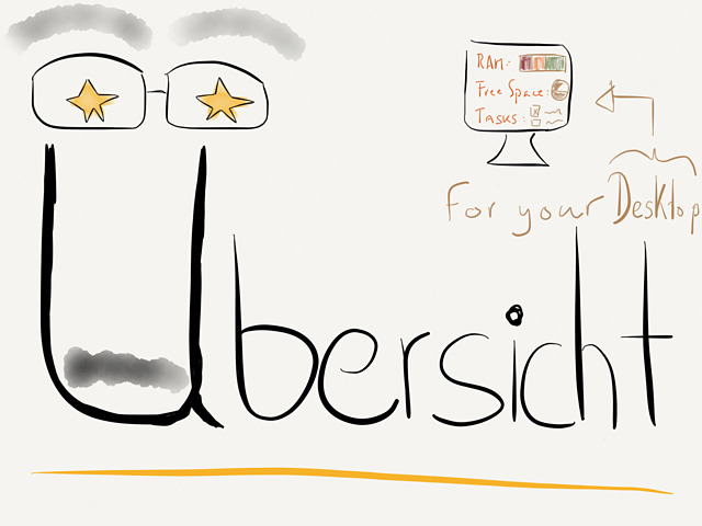
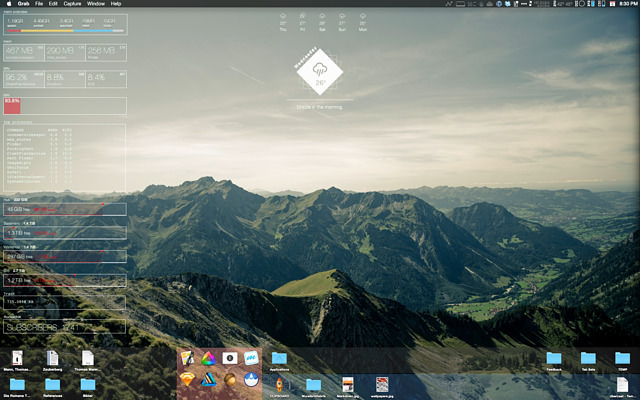
There’s a new contender on Mac OS X for widgets on your Desktop. It’s called Übersicht and the way it’s build makes it in my option far superior to it’s popular contenders, namely GeekTool and Nerdtool.
Übersicht widgets can be build with JavaScript (or CoffeeScript). So with a bit of HTML and CSS you can make really nice looking widgets without relying on hacks. Just take a look at the current gallery.
But who better to tell you better what the benefits of Übersicht are than the developer himself. Here’s a comment of Felix Hageloh from the Lifehacker comment section:
… it is easy to do charts, graphs and even animations in Übersicht if you are comfortable with HTML/javascript! Another advantage is that your widgets’ position won’t break when you plug in a different size display. This is possible because of CSS positioning: you can say ‘position 10 pixels from the right edge of the screen’ and your widget will stay there no matter how large the display is.
Placing widgets on a fixed absolute position is my favorite “feature” over GeekTool – if I change my screens resolution my widgets are still where they belong. The first tweets I read complained exactly about this: there is no way to just drag and drop a widget where you like to have it. You have to edit the CSS values inside the widget to place it where you want it. And… since the customer is the king, Felix is already planning to integrate a drag and drop option (although one of the main reasons why he build Übersicht was to have absolute control over the position rather than vaguely placing something somewhere on the screen).
If you want to more about Felix and why he created Übersicht you can check out this 27 minute CSS on the Desktop talk from him (Warning: 420p ahead).
Bonus points for Übersicht: It’s not as resource hungry as GeekTool. If your comfortable with JavaScript (or CSS/SASS) it’s actually easier to write a widget for it.
Given it’s currently at Version 0.2 there aren’t much widgets for you to download. But it’s fairly easy to convert your existing GeekTool widgets if you look at the explanations on GitHub – it’s also open-source, so fork ahead.
That said, it also misses some key features like dual monitor support. At the moment you can only select one screen.
I think/hope/wish that it’s only a matter of time when Brett Terpstra switches to Übersicht and converts his GeekTool showcase to make it even more “übersichtlicher”.
I found another piece of information by Felix Hageloh than can make writing widgets a tad easier, so I thought I add it here:
So in essence the app is just a large WebView that is glued to your desktop and widgets are little snippets of HTML+CSS+JS. Of course you can’t run system commands from within a WebView, so the app comes with a NodeJs backend. For more details on that, you can checkout out the slides for my talk at the local Amsterdam JavaScript Meetup.
Hi, first and foremost an apology for me being absent on RocketINK… but not only the blog took a downtime. In the meantime I sorted out some of life’s issues that arise from time to time, started a new side-project (Der Ubercast - a German tech podcast with an aeronautic theme), gathered material for a link list that would fill pages and also made some more Keyboard Maestro macros.
A word of warning, I will start out slowly since I’m now determined to finish my BA thesis as swift as possible. Yep. I got priorities now. And as a side note, this blog ranks pretty high in my book. The sad truth is, I had to figure out the hard way that me procrastinating on one major thing ultimately will slow down everything else. I knew it all along, but it took some time to sink in.1
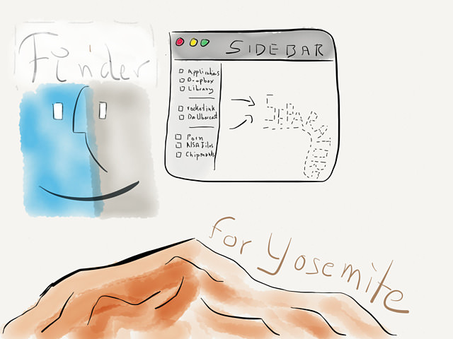
Yosemite Sidebar Separators
Now to the meat of this post. It’s light-weight, like I mentioned above. We will start gently. What we are dealing with is a follow-up to an old post of mine which was a follow-up to an ever older post from 2011 when I briefly gave Google+ a go as blogging platform: sidebar separators for OS 10.10. And let me tell you, they are a thing of beauty and shine like the only have shimmered before Lion.
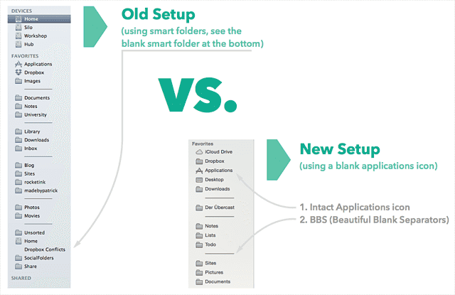
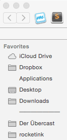
In former builds (≤ Snow Leopard) our lovely operating system of choice needed no extra tweaking to add this little hack to the Finder. Later we needed to decided which default icon we wanted to display with a blank icon, the applications folder or smart folders. As of today, we still need to replace the Applications folder file, but this time our applications folder icon stays intact whilst or separators just work and have no icon in front of them. Nice.
In the attached download you’ll find a zip file with the following content:
the replacement file with a blank icon
a backup folder with the original Yosemite icon
Applications folder with 8 dummy applications (which will do absolutely nothing when clicked)
an alias to the system folder where we need to replace the file
UPDATE (Nov 13, 2014): Attention. Currently this hack seems to be irreversible. There was no problem restoring to default in versions prior to OS X 10.10, but Yosemite is stubborn. I strongly recommend not to do this unless you’re absolutely sure you can live without an icon on the applications folder.
UPDATE (Aug 6, 2014): Sadly, as of today (Aug 6, 2014) Apple “fixed” this behavior in the latest Yosemite beta build. The Applications folder is nude again. If you can live with this (see screen shot below) just head on and download the package. If not, you’re only alternative at this point is to choose a blank smart folders icon (see my old post mentioned at the top). I decided to stick with this solution since there is only one Applications folder vs. multiple smart folders.
Step by step guide
Download the file above.
Drag SidebarApplicationsFolder.icns onto the Drop here - Resources alias folder.
Add the dummy applications to your sidebar at the position where you want to add a separator. You’ll need to drag the files whilst holding down the command key (⌘). If you need more separators duplicate them and add another space to the name.
To make the changes appear in your Finder hit the terminal and enter killAll Finder, if that doesn’t do the trick you can try killAll SystemUIServer or just log out and back in again.
Enjoy.
I’m really not good at managing priorities. But I’m learning. ↩
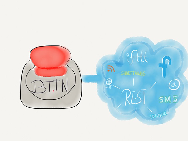
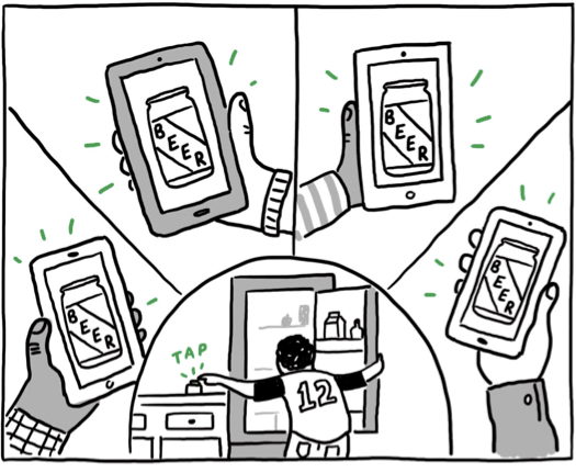
Ever wondered what if you could trigger IFTTT actions via a button? Well, for 69 Euros (roughly $94) you can stop pondering and start pushing “The bttn”.
On the official website there are several use cases outlined like your child could send a message with the push of a button when arriving from school or the bttn could remind you to take your medicine since it also has a wait-mode where it pulses slow (and later more rapidly if you decide to ignore it). Another popular use case is this scenario which is very common in shared flats:
Despite that, the bttn mainly targets business owners. I’m sure there’s a wide variety of options where a button like the bttn makes sense, from the small local pizza place up to a big logistics and delivery company. In all honesty, who can resist pressing a red button?
Since the bttn’s LED lights can emulate four states, I’m already trying to think of actions where the bttn could help me bring some visual feedback into my GTD system. I’m not sure if it’s versatile enough for me, but it should be possible to send a timer via Launch Center Pro to IFTTT and get the bttn to blink. It’s no replacement for Due, but for important timers I can see it working.
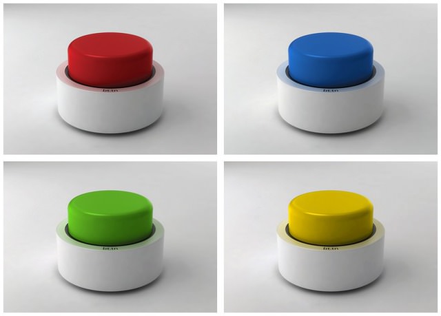
Green
Yellow
Red
Blue
command executed
wait
error
???
My best guess is that blue is used for the pulsing.
The bttn is build for indoor use and is powered by a battery or micro USB-cable. It works by sending a (free) message via the built-in GSM modem or over your home Wi-Fi to the companies server where it gets forwarded to your pre-configured IFTTT action. In the comments of this TechCrunch article it’s also mentioned by an employee that they are working on a Zapier integration.
Said article also highlights that there’s a business model with monthly fees:
The business model for a b2b-focused bttn will be monthly fees — something that corporate partners are more likely to be happy to pay for than private users. But early bttn adopters can snag the device without the monthly fee. Those who pre-order the device now can expect it to ship in October.
I’m not sure if this will only be mandatory for business who order a certain amount of units or if home users would have to pay that fee, too, after the pre-order sale ends on the 31st August.
When the Microsoft Surface was announced along with the keyboard cover my friends where very excited. That simple elastic keyboard which doubles as a cover was something that Microsoft definitely did right.
Although it can’t hold up to a real keyboard where haptic and usability are superior, it is a nice addition.
Just like there is a standard suite of apps installed on your iPad to take notes, write emails, make calls, etc., there should be an input devices which is there for you when you’re in need of writing over a longer period of time and which is out of the way if you don’t need it.
In short, it is something many people, including myself, wished that Apple would offer, too.
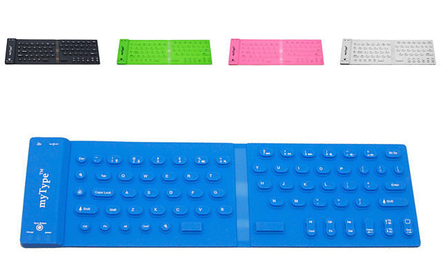
Well, Apple so far Apple hasn’t put much effort on this front, but some engineers have tried to fill that gap. One of them which demoed a keyboard in January 2012 which looked like a solid product. Good things take a while but the MyType keyboard was successfully founded in August 2013 and you can order one for $59.95 in their online shop.
It doesn’t double as a cover, but it’s flexible, portable and my guess is that typing on it isn’t to bad for a gadget that aims at taking less space up in your bag than a full-size non-foldable keyboard.
Update:I already own the Logitech Tablet Keyboard, the same that Federico reviewed. Personally, I’d regard this keyboard more as an addition or backup keyboard. One that can stay in the bag all the time and is there when you need it. Although being relatively small, I think twice before putting the Logitech in my bag.
The Stats:
Features
• Desktop Key Spacing When Open
• Pocket Sized When Closed
• Use for Business, School, or Travel
• Completely Wireless With Bluetooth Technology
• Available in Five Colors: Black, White, Blue, Green, and Pink
Keyboard Specifications
• Dimensions When Open: 12.5” x 3.6” x .3”
• Dimensions When Closed: 6.8” x 3.6” x .3”
• Tested at 75 Words per Minute
• Rechargeable Lithium Ion Battery
• Battery Life: ~8 Hours of Typing
• Micro USB Charging
• BlueTooth 2.1
• Max Wireless Range: 33 Feet
• Splash Resistant
• Works with iPhone, iPad 2/3, iPAD Mini, iPod Touch, and Android (with HID support), Window 8 Tablets
 Link: Full-Screen Image