April 07, 2013

In my Sweet Mac Setup post for Shawn Blanc I mentioned how I use Markdown to format my flashcards for Flashcards Deluxe. This post is about the Keyboard Maestro macro that formats Markdown into a compatible format for Flashcards Deluxe.
Since there are so many Flashcards apps on the iOS market and the range of different flashcards styles within Flashcard Deluxe grows from year to year this post will undoubtedly only be useful to a handful of people, but hopefully you might get some ideas for other use cases.
Some of the basic functions of the macro
- It takes a level 3 heading in markdown and converts it to a new question card.
- Every list item is converted into a new line too.
- A double space is also a new line.
- Two asterisks are converted to bold text
- Everything in a quote is the answer card to the question.
Example 1
This is the easiest and most bullet-proof way to setup a flashcard. Use a list for the different answers, copy everything you want to have on the answer card and put it in quotes.
### Task Number 1
**What is the answer to life, the universe and everything?**
- a. Finding a needle in a haystack.
- b. Planting a tree.
- c. 42.
> - a. Finding a needle in a haystack.
> - b. Planting a tree.
> - ***c. 42.***
The result is this text:
Task Number 1||<b>What is the answer to life, the universe and everything?</b>||a. Finding a needle in a haystack.||b. Planting a tree.||c. 42. a. Finding a needle in a haystack.||b. Planting a tree.||<color lime>c. 42.</color>
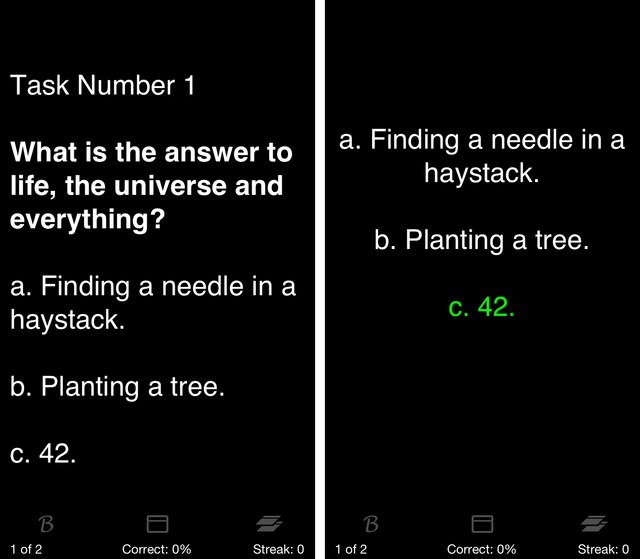
In Flashcards Deluxe the question and answer cards will look like this:

Example 2
In this example I use Markdowns “two spaces” equals a new line syntax instead of a list. This has proven to be more prone to errors so I would only suggest to use it if you want a more readable Markdown document.
### Task Number 2: Mark all correct answers.
**1. Is it a fruit?**
◦ Banana ◦ Tomato ◦ Pear ◦Potato
**2. What software really exists?**
◦ iPod ◦ iMovie ◦ iTunes ◦ iPad Mini
> **1. Is it a fruit?**
>
> ***◦ Banana*** ***◦ Tomato*** ***◦ Pear*** ◦Potato
>
> **2. What software really exists?**
>
> ***◦ iPod*** ◦ iMovie ***◦ iTunes*** ◦ iPad Mini
The result is this text:
Task Number 2: Mark all correct answers.||<b>1. Is it a fruit?</b> ||◦ Banana ◦ Tomato ◦ Pear ◦Potato||<b>2. What software really exists?</b> ||◦ iPod ◦ iMovie ◦ iTunes ◦ iPad Mini <b>1. Is it a fruit?</b>||<color lime>◦ Banana</color> <color lime>◦ Tomato</color> <color lime>◦ Pear</color> ◦Potato||<b>2. What software really exists?</b>||<color lime>◦ iPod</color> ◦ iMovie <color lime>◦ iTunes</color> ◦ iPad Mini
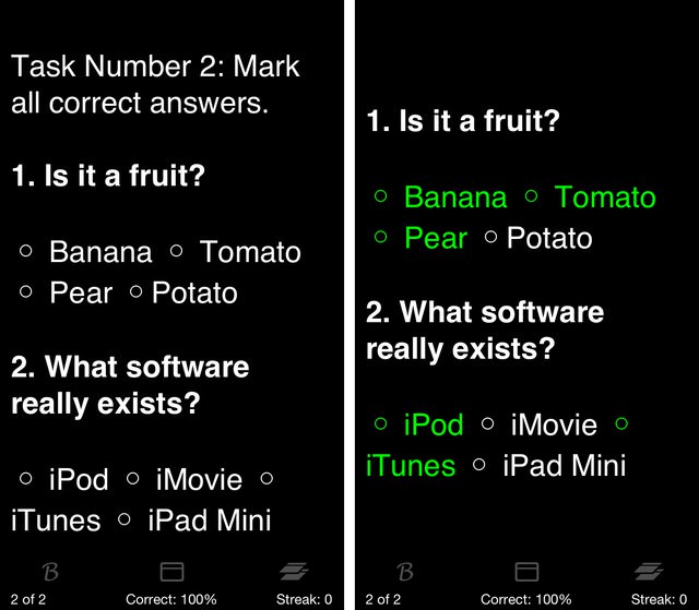
In Flashcards Deluxe the question and answer cards will look like this:

For customizing the macro to fit your Flashcards Deluxe needs visit the developers site and check out the “Creating Your Flashcard Text – Formatting Text” section.
There’s much more possible with Flashcards Deluxe and you might see me posting some other use cases involving pictures sooner or later.
DOWNLOAD
Bonus. Okay… if you made it this far you might want to see how much I suck at regular expressions:

April 04, 2013

The Mac OS X Finder is a great application. Despite using Path Finder I also work in the default Finder. There’s a plethora of add-ons for the Finder and it took me quite some time to realize that the Finder doesn’t necessarily need any heavy additional tweaks. After using a variety of apps that sit on top of the Finder over the last years, nowadays my life with the Finder follows a much simpler doctrine: back to the basics and away with the additional bulk.
This post is about the Finder. It’s a very basic one too, so you might not find anything new or secret tweaks. However, since I personally enjoy to see how other people use their Mac - especially how they use more common applications - I decided it’s about time to show you my Finder setup.
General Appearance

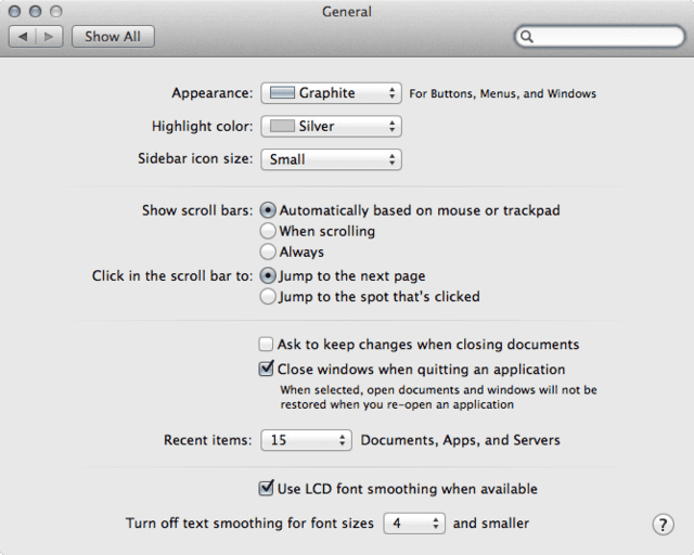
If you take a look at the screen shot you can see that I like my OS and therefore also the clothes of the Finder to look a little bit more subtle than the appearance you get with the default settings.
Unlike most power users who prefer to work in the column view I like the list view a lot better. I find the fixed characteristic of it works better for me. In addition I choose the icon view for some of my image folders. If I set icon view as the default for a folder I usually also enable “Show item info” along with it in the view options. Instantly seeing the dimensions of an image is very helpful when doing web design or trying to clean my wallpaper collection. If there was an option to display it in list view I’d probably use it too.
Update: If you’re on Yosemite I have an updated guide for the separators. Apparently things changed for the better.

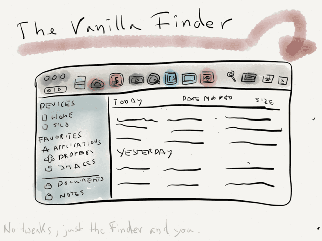
One of the first things I missed in Mountain Lion were separators for the sidebar. In former OS X builds there was a smart guy who provided a pack of dummy applications with a transparent icons as a download. The trick was that you couldn’t click on the applications, this way they really felt like part of the UI at some point.
In Lion this trick didn’t work anymore. All applications in the sidebar suddenly got a generic applications icon assigned to them. So, I had to come up with a workaround - it’s quite old now, but I still use it since I love my separators. Here we go:
Since I barely use smart folders in my sidebar I assigned an empty icon to them. You can do the same with applications in case you don’t use them in your sidebar. The downside of the latter is that the Applications folder itself will be invisible… of course you could remove it from the sidebar and simple access it via in any Finder window by pressing the shortcut ⇧⌘A.
Download Finder Sidebar Separators
Update – Here’s how to setup the Finder sidebar separators by changing the smart folder icon:
The “Drop here - Resources” folder is an alias to the system folder where the icons are stored. So the first thing you need to do if you want to replace the smart folder icon with an empty icon is to drag the “SidebarSmartFolder.icns” in there. You might need to log out and back in again for the changes to take effect or opener Terminal and killall SystemUIServer.
The last step is to copy the “Smart Folders” folder from the disk image to your Mac and drag a folder to the sidebar while holding down the command button.
The “Originals” folder just contains a backup of the default icons for smart folders and applications for your convenience.
You can spot the drawback of using this method at the bottom of my sidebar. The smart folder “Dropbox Conflicts” doesn’t have an icon assigned to it.
The rest of my sidebar is pretty self-explanatory. I tried to keep the number of folders to a minimum as I access most parts of my file system via LaunchBar.
PS: Don’t ever name one of your hard drives “Home” (see the bottom of my sidebar again).

The toolbar is a great place to collect frequently used apps, locations and even scripts. For me it only makes sense to put just applications in it that function as droplets (by which I mean that they accept drag and drop operations).
I have 5 zones which - before Mountain Lion - were divided by a separator. Unfortunately Apple decided to drop that little feature.
| Zone 1 |
Zone 2 |
Zone 3 |
Zone 4 |
Zone 5 |
| Documents |
Movies |
Images |
Locations |
Tools |
Although I use LaunchBar most times, I find it handy to have certain apps in the toolbar. I convert a lot of documentaries from the German public broadcasting services. So, having QuickTime and MediaInfo in my toolbar makes sense in my case. Anyway, here’s a more detailed look on what has made it into my toolbar:
- Marked is my previewer for everything text. It has the most prominent place in the toolbar.
- Kaleidoscope is right beside it because I need it from time to time to analyze differences in files (yeah, mainly text files).
- Sublime Text 2 for randomly droping snippets, scripts and coding stuff on it.
- MPlayerX. I might replace it with Movist which supports resizing from windows from all window sides (I’d like that).
- QuickTime Player 7, more precisely: the pro version. It’s very handy to quickly trim, rotate or convert video material.
- Photoshop is still my go-to image editor, even for minor edits.
- ViewIt is an old and ugly on the one side but on ther other it’s a very fast image viewer.
- The box icons is a folder where I drag stuff to which is supposed be on my Laptop. On the MacBook the same folder links to a corresponding folder in my Dropbox for the Mac Pro.
- MediaInfo Mac displays all relevant information about a media file. This is the old free version of the app which is way better and feature rich than the new paid version. If you look for a similar app, grab the old version or check out VideoSpec.
- Activity Monitor. I had cases where my keyboard wouldn’t respond anymore. Having the Activity Monitor in the toolbar leaves me with the option to open it and force quit the culprit with the mouse.
- LSelect for making complex Finder selections. It’s actually pretty cool once you get the hang of it (here’s a link to a demo video).
- (Enhanced) Open Terminal Here has some cool features that the original AppleScript by Marc Liyanage misses.
- The default Arrange item from Finder. I don’t use it that often and might remove it sooner or later.
- Honestly, I don’t know why the Share button is still in the toolbar. I barely use it.
- The Label item is also neglected and vegetates in the toolbar since Keyboard Maestro is the faster way to label selected files.
Dismissed Tweaks
However, if you’re all-in for tweaks here’s a small list of what I tried over the years. Admitted this list isn’t complete at all but it’s all I managed to remember… I didn’t put window managers, task switcher replacements and so on the list either because I feel this would beyond of the scope of this article.
- XtraFinder and TotalFinder - what I like most about these apps are the tabs. It’s the only thing that could tempt me to run one of the two applications again (and I just made a clean cut ditching TotalFinder on the Mac Pro and I admit that I still use it on my MacBook).
- HyperDock - I forgot that it was installed on my latop all along until I did my spring cleaning and got rid of all the unecessary ballast.
- TotalSpaces - initially I missed the old Spaces in from the pre-Lion OS’s. However, now I can do without it. Side note: I also barely use Mission Control. If I want to reach a specific window I use the switcher (
⌘+TAB/⌘+⇧+TAB) or move the focus to the next window via cmd+`.
- Colorful Sidebar » SideEffects - I loath having to face the monochrome sidebar introduced in Lion, but still I decided to drop the colored sidebar.
- Afloat (or WindowShadeX by ManyTricks or Deskcovery or WindowMizer). There was a time when I liked using collapsed Finder windows and floating windows. I still can see use cases but I also know that I can do without them.
