IFTTT — Expectations, Musings and a Mockup

A couple of days ago IFTTT announced on their Updates blog that the web service is now optimized for any screen. The last paragraph read like this:
Want more for mobile? Stay tuned!
Since basically every major IFTTT update is worth a tweet I did exactly that and also expressed how much I was looking forward to a native iPhone app.
We’re halfway there to one of my most anticipated apps: @IFTTT is now optimized for all screens and devices (+ hinting at more to come).
— Patrick Welker (@_patrickwelker) June 20, 2013Shortly afterwards IFTTT was so kind and replied with a link to the private beta (which I was accepted to this morning). You all know how it is with private betas – you’re not supposed to be talking about them publicly, so what you shouldn’t expect is a post about the awesome new IFTTT app.
By now you might wonder what is this all about. Well, allow me to shed some light on what’s happened…. I was eager to try the app, so I grabbed my celebration touch screen cloth and wiped my screen to get an “unsmudged” look on all the glory that was awaiting me. But I hesitated and thought it would be a good idea to write down first what I expect from an application that I anticipated for a long time and what I think it might could look like. So here’s me going on about what I’d like to see in IFTTT for iOS.
The status quo
IFTTT already has a web application which is pretty, minimal and clearly arranged. Still, when thinking of the screen real estate an iPhone has to offer there must be some rather strict decisions how to port the most important functions with a minimum amount of friction.
Here’s an outline of what the IFTTT navigation menu of the web app looks like:
- My Recipes
- Show personal recipes
- Show shared recipes
- A filter for each
- The option to create a new recipe
- Some stats
- Browse Recipes
- Search
- Filter by channel
- Sort by what’s hot, popular or new
- Channels
- User
- Dashboard
- Activity log
- Recent Files
- Account1
- Settings
- Invitations
That’s a lot of entries for a small device. So here’s how I imagine the app to work. My recipes and browsing recipes could be unified. By default only your active recipes are getting displayed, but there could be a tab bar at the top or bottom where one could switch between personal, shared and global recipes. By sliding down a search field appears at the top, just like the new iOS 7 spotlight search. If IFTTT manages to come up with a global search where filters are easily accesible, this will definitely be something to look forward to.
On another note search itself is an important function of IFTTT and I could also see it not hidden away by a slide option. Search would also be a good location to place the “Suggested Recipes” section from the web app’s dashboard by default. I just don’t see suggestions of recipes on the iOS dashboard of IFTTT. It reminds me of the “Recommended Sites” section at Newsblur – I don’t use and don’t want to see it on such a prominent place (and I’m not alone).
The settings could easily be merged with the upcoming (premium) account. I guess it makes sense to have only one of those and make it accessible via the obligatory cog-wheel, an “i”(nformation) icon or inside of a popular slide-out navigation menu.
The upcoming UI/UX

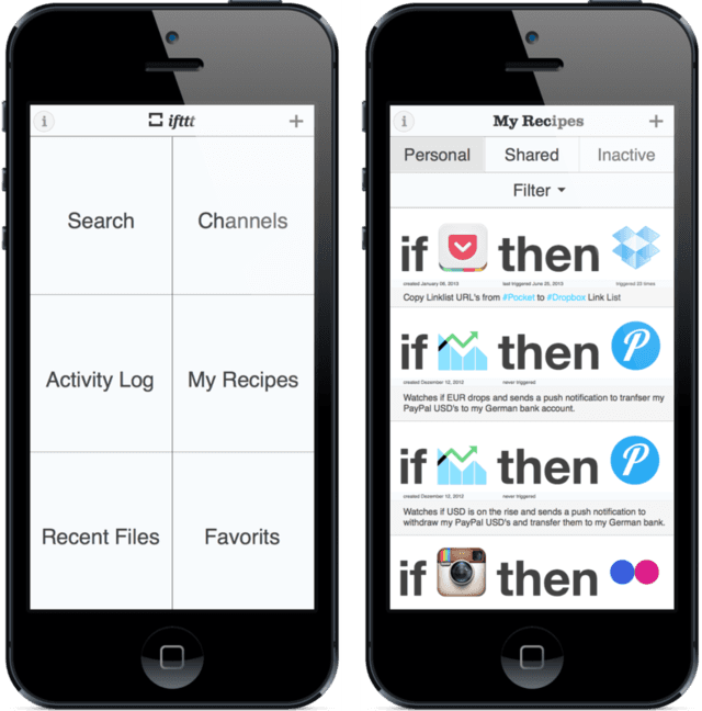
One option for the look of the dashboard on the iPhone could resemble the menu outlined above. If this is the case I can imagine a minimalistic, metro-like interface with a cleaned-up dashboard. After all IFTTT is using colored blocks in their logo, so they might get away with using the same principle for structuring their UI this way, even if it’s an iOS app. If they decide to do so the tiles could use their brand colors and variations of them, in addition they could make use of the monochrome version of their logo to not literally throw color at the user everywhere.
Another cool alternative to the metro look alike would be to list all your recipes on the first screen. At the end of the day IFTTT is a collection of recipes and it makes sense to browse them in a list. One of the activities I do when I’m on IFTTT’s website is tweaking my recipes or activating and deactivating some of them. This option would go well with a slide-out navigation.
Adding new recipes should be prominent and easily reachable. Since this is what I believe most users visit rather often. I can think of several moments where I fired up the web app in 1Password to instantly create a recipe I just came up with before I forget about it. That’s why I think a classic omni-present “add” button in the menubar at the top or the bottom makes sense for IFTTT; just like one can add a new inbox item in OmniFocus from everywhere within the app.
My Mockup
I recently started using Sketch. To get to know the app better I decided to make this a small training session, so I did a quick and dirty job on creating an IFTTT app concept mockup with the help of Robbie Pearce’s iOS devices template. Click the following link for an…
interactive IFTTT concept demo
You’re back? Okay, now that you’ve seen it, you probably realize that it isn’t a thing of beauty and for sure the talented guys at IFTTT will come up with something more aesthetically pleasing and also more functional than my 30 minute job. While writing this article I can already see the faults of this design concept shining through the display. But the thing with me is, just like I mentioned in the recent BitQuill interview when I talked about logo design, I need to see something in front of me to see if it works. And as it’s already done, why not throw it on top of this post.
Disclaimer: I don’t think this is the best and only way IFTTT should or can look.
Notifications Musings
IFTTT already has the Pushover app on board for notifications. Anyway, local alarms would be splendid – maybe that’s even something to consider making a premium only feature.
OmniFocus has basic support for the stock Reminders app, maybe IFTTT can harvest the data in the app to pull off some cool stuff. On the same page would be a tighter integration with the Apple Calendars app. I have no idea if this is possible at all API-wise, but it would certainly be nice to use this data for triggers. I can right away image some triggers like a creating a personal log in a text file out of this data or even a recipe like IF I received a call/mail/calendar invitation THEN Remind me at 8 pm to deal with it. This would be brilliant to remind onself of deferred tasks and other actions like this. In the end I doubt this would work since I’m not sure it’s possible to get access to incoming iOS activities like calls, etc.
Lastly, I have to say that I’d prefer local notifications and alarms over the notifications of the Reminders app although integration with it is more reliable for urgent notifications since they also work when the iPhone is on mute.
Last words
To wrap it up: what I can’t wait to see is what the default screen of the app looks like, if there are options the to define what is displayed on that screen, how the IFTTT team approached the search functionality and how the vibe of general layout is. Certainly I’m most interested in how the recipe list is looking and if it’s concise and has enough room for displaying lots of recipes on one page - my fingers are crossed for endless scrolling opposed to recipe pages. In addition a filter to show only active or only inactive recipes would be most welcome.
With IFTTT the web app we have a minimalistic design combined with a large typography. It will be exciting to see how the large typo and big icons get transfered into the iPhone’s smaller dimensions. Again, hopefully there will be enough space to show many recipes on one page.2
-
I’m happy IFTTT is going to introduce premium accounts soon. They deserve being payed for this awesome service. This also puts my mind at ease and I don’t have to worry about the future of IFTTT anymore. ↩
-
A hope which I by the way share for the next version of the App Store itself. It just not made for browsing and discovering new apps. ↩