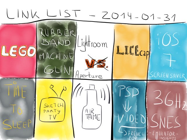
January 01, 2014
A word upfront: this is not intended to be a detailed description of a design process, but rather written for your entertainment. So, instead of a strict 1-2-3 workflow, I wanted to write down my journey on the way to the final version.
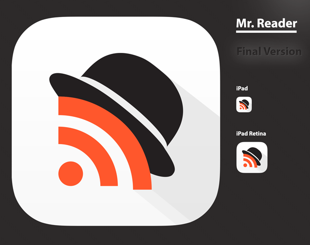
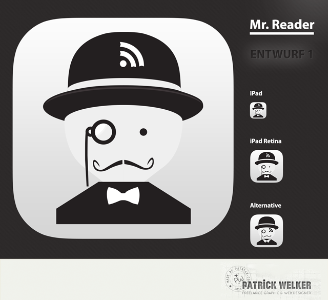
Icon redesign for the upcoming iOS 7 release of the popular and powerful RSS News Reader “Mr. Reader”.
The Roots
Before I start let’s have a look at the old icon of Mr. Reader:
The pre-iOS 7 icon from Mr. Reader
I am, as many others are, a fan of Mr. Reader. So I wanted to get it right and avoid comments from my Internet pals like these:
Gabe Weatherhead from Macdrifter:
I certainly didn’t switch for the icon. But then again, I’ve never used or avoided an app solely because of it’s icon. That’s just moronic.
Justin Blanton from Hypertext:
I’m not a big fan of the name or the icon.
David Sparks from MacSparky:
I took a few cheap shots at Mr. Reader’s icon yesterday on Twitter and received a mixture of scolding and agreement. I can’t help it. Those RSS eyes creep me out. Once you open, Mr. Reader though, it is a really nice experience.
Phillip Johns from Appstorm
The other complaint is the icon. The icon fits the name but it’s not visually appealing sitting in my dock. For some users I know these items are deal breakers but I find the functionality of the app far surpasses these minor annoyances.
I’m not trying to bash the old icon here. Matter of fact, I didn’t mind it at all (despite preferring and wearing a smaller mustache myself). It’s far from ugly. The designer obviously knows his craft. Beauty is in the eye of the beholder. And, like David Sparks experienced on Twitter; there are a lot of people who liked it as it is, too.
Still, having read the quotes from above, they are burned into my mind. Additionally, they are all from people I read and respect and who happen to like the app. It might be unnecessary to emphasize this, but one of my top priorities was to make a peaceful co-existence happen between the Mr. Reader that sits in peoples dock and on their home screen and the high-speed data highway that exists between their retina and the brains evaluation center. This is what my personal mission was all about. Well then, let the voyage begin.
A Slow Transition
The goal was to carry the spirit of Mr. Reader to the new OS. So the icon needed to feel lighter and right at home on iOS 7. I won’t lie, the design process itself for a typical icon of the new platform which iOS 7 is, allows for a much more simpler approach than in the pre-iOS 7 era. With iOS 7 icons you spend more time thinking about what works best with Apple’s paradigm of minimalism, rather than fine-tuning every pixel of a drop-shadow.
Usually my first step is to doodle, so this is what I did:
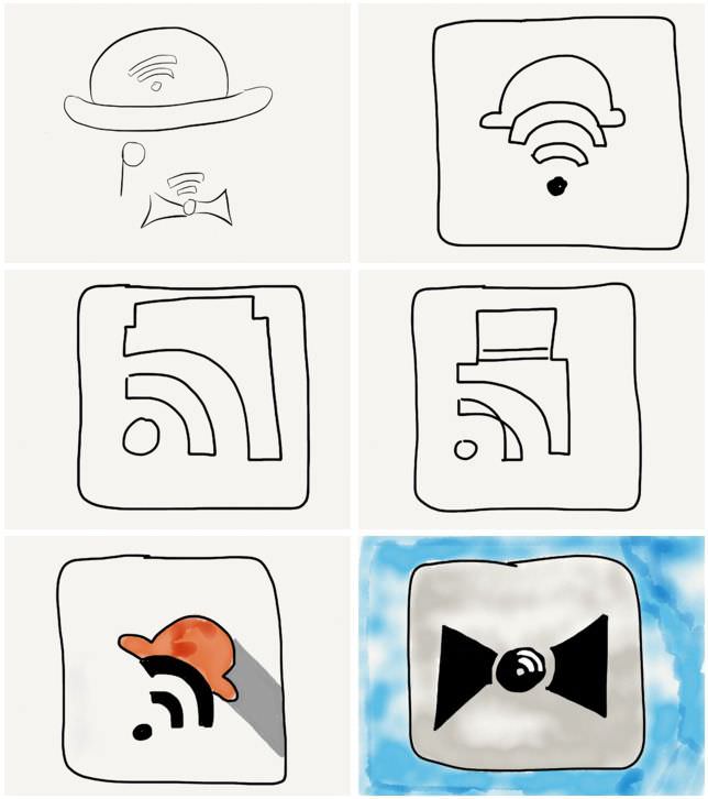
Phase 0: the quick and dirty phase. Doodle around to get all ideas out of the head.
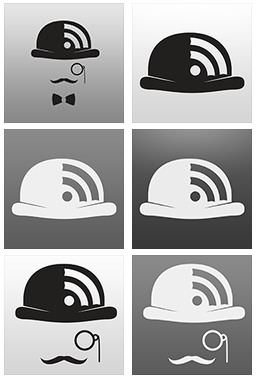
The first idea I got was to keep the Gentleman theme going and stick to the key components of the original icon: bowler, monocle and mustache.
So, the one in the upper left was an idea I wanted to play with and see if it felt right. I did a few mockups in Illustrator:
Phase 1: Get a look and feel of what the sketches look like. Do a simple mockup.
Anyway, all the mockups weren’t that great and I knew it. I tried variations with…
- a thicker monocle,
- different monocles,
- different bow ties,
- different mustaches,
- and color variations.
But no matter what I did, the proportions were always horrible. In short: too much empty space, even for the minimal taste (which I tend to prefer), and, on iOS the icon looked just plain ugly.
The mockups above are just an abstract of the ideas that did not work out at all. I find it important to highlight the fails, too, not only the success. This would be a pretty boring read otherwise.
In addition, I also had some ideas which turned out to be rather nice and which where looking kind of cool, but I’ll spare you the details since I like the contrast between crap and actual design in this post (– plus, I can keep them in my pocket in case I can make use of them in another project).
A new direction
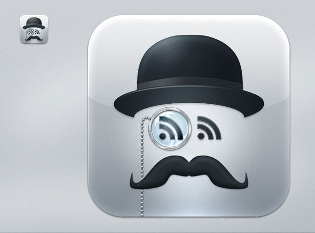
If you’re a Forrst member, you might have come across my initial draft which looked like this:
One of my first drafts for the new Mr. Reader icon.
The post I linked above highlights how the Forrst community helped me get rid of a lot of unnecessary elements of the icon.
As you can see in the screen shot below, the mockups of the 2nd idea already looked better on the home screen than my initial sketches.
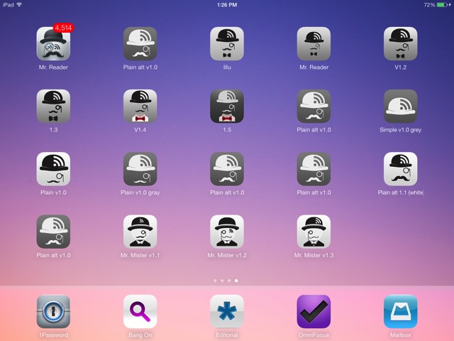
Mr. Reader - The Deployment: invasion of a home screen.
Some users, Forrsters and friends of mine liked the whimsicalness of the final version of my 1st draft. But the feedback from Oliver Fürniß, the developer of Mr. Reader, was the most important part. After all, Oliver was looking for something more modern and not too retro.
U-turn in the right direction
Personally, I felt the same way. It just was too much detail and all of that. So, since it wasn’t exactly what I wanted see on my home screen every day and I went back to the drawing board. After bouncing back one or two ideas with Oliver I focused on my new idea: everything had to go, the monocle, the stache, even the lovely bow tie.
Letting go isn’t hard if you know you can do better. So after having settled with my new idea (see the image below) I did a few color variations… and at one point even a RSS mullet version. The point is, I instantly had a good feeling and my gut told me this is it.

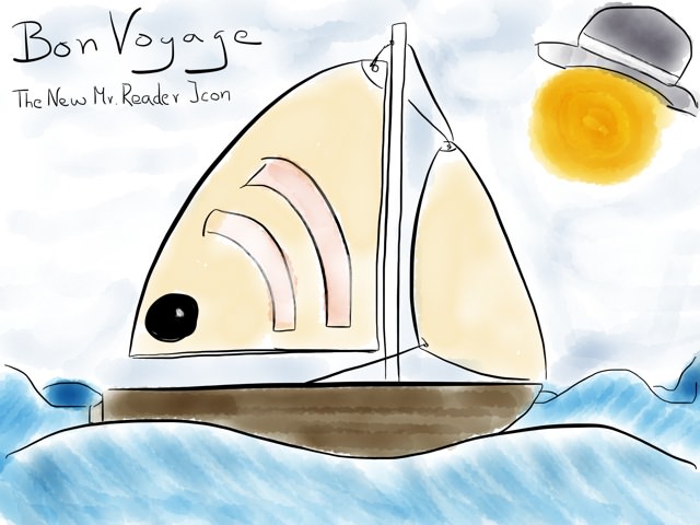
Final Phase. Color iterations and a hockey hair version.
I don’t know why, but somehow I liked the idea that the shade could double as a finger with black nail polish.
Close your eyes and envision a goth kid opening Mr. Reader with the touch of his index finger. Now, breath in deeply. Can you smell the heavy scent of patchouli hovering in front of you? Bask it in and browse that dark feeds of yours.
Okay, admitted… pretty far fetched, and, thanks god it neither is a relevant association, nor one which should be obvious when opening the app.
Back to the facts. The only decision to be made was to settle for a gradient and play with the color of the shade until it fit the design.

Getting closer… last iterations.
So, I made the adjustments, deliberately decided not to use the golden ratio as the yardstick for all things and made the icon a tad smaller. After all iOS 7 is a new playground and nothing is set in stone.
The developer liked it, too, the beta testers also seemed to dig it. And this is how I got to design an icon for one of my favorite apps for the iPad. This was the best Christmas presents out of all of them.
So, what else to than to…
Mr. Dev. You’ve got mail.
In the rare case you haven’t heard of Mr. Reader and why it is such an amazing power tool for plowing through a horde of RSS feeds, head over to my blog and read the article about why this is a must-have tool for RSS power users.
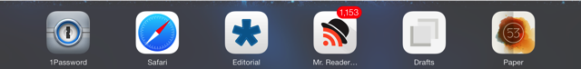
Mr. Reader now feels right at home right at your dock. Here’s a picture of him among friends. They’re having a party at my dock.