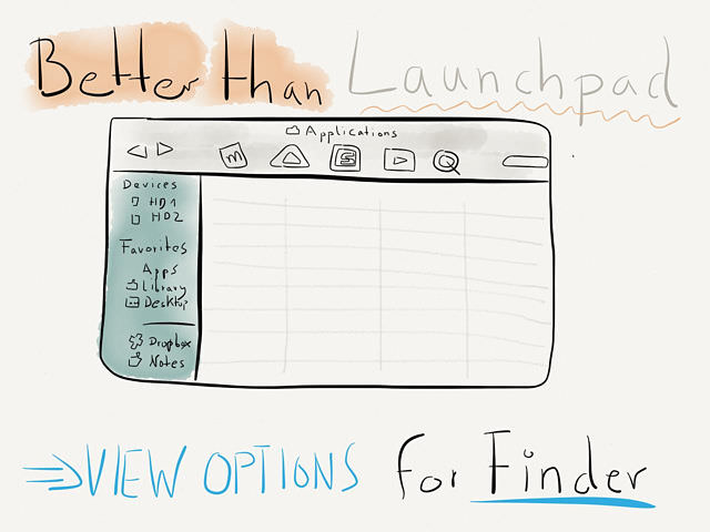
Better than Apple's Launchpad

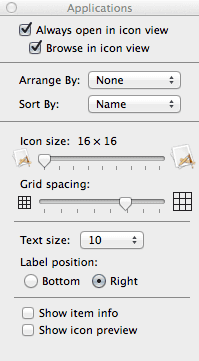
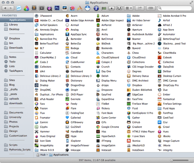
Back to the basics. This is in my humble opinion the best view setting (⌘J or Finder > View > Show View Options) you can set up for your Applications folder.

With almost 400 apps I have to occasionally find an app which name I can’t remember at all. I find Launchpad a pain in the behind to maintain and Alred or LaunchBar don’t do me any good if I have no clue what to search for. This view allows me to find what I’m looking for pretty fast with a birds-eye perspective

Before the Mac App Store arrived I used to color code the apps into categories (design, music, system, web development, etc.) and sorted them by label. But ever since its introduction some apps just refused to take a label (no matter if the corrects rights were assigned). Other labels were overwritten after they got updated and my automatic Hazel rule wouldn’t work for them. Nowadays everything in my applications folder is without a tag or label.1
Short, super-simple and sweet. That’s it.2
-
I probably should look into tags for grouping, but I read somewhere that the same problems still persist. So this is postponed for now. ↩
-
… and yes, I hestitated to post this because it’s so basic. Then again, I forgot to set this up after installing Mavericks and have tried to use Launchpad on the few occasions that I had to search for some mysterious app. I was glad that I remembered the good old list view and voilà, here’s a post about it. ↩